What’s in a name?
January 15, 2016
Are you word blind?
April 14, 2016Like me you probably remember sitting in the classroom learning some of the “rules” of the English language. Apostrophes are to show possession or missing letters. Full stops are a long pause when reading and are needed to end a sentence. Commas are a short pause and are used in lists. Capital letters start sentences, denote proper nouns and you use one for every word in a title, except connecting words.
Now it’s a good job language is fluid because to be honest, this whole mish-mash of capital and lower case letters makes my eyes fuzzy. Who decided that connecting words are second class citizens anyway?
It’s personal
It is perhaps due to my career in media management and PR that I hate the idea of random capital letters spattered around in a headline or title. Pick up any newspaper or magazine and you’ll see they either use all capital letters so the headline shouts out to you, or they capitalise the first word of the headline and the rest of the words are all lower case.
This is, of course, a matter of personal taste, but the Plain English Campaign are also in favour of this more modern style, listing as one of the uses of capital letters: “At the start of titles and subtitles.”
Entitled?
Job titles are another place where people like to keep capital letters. Again it’s my career dealing with newspapers and journalists which makes me prefer to use lower case letters – although on this occasion it’s technically correct to use capitals if you wish.
The issue here is that it was my job for a long time to write copy which could be cut and pasted on to a newspaper page (yes, it happens). A journalist would only have to cap down the job title and that might lead them to edit my copy further – which reduced the chances of it appearing in print exactly as I presented it.
When capital letters go wrong…
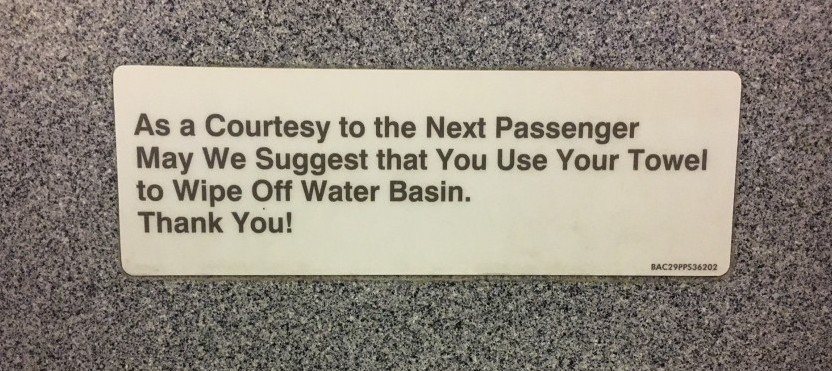
The problem with using the rule we may all have been taught at school is that people get confused and signs like this one appear (I’m looking at you, RyanAir comms people).
Technically the words on that sign are not a title (you don’t need a full stop to end one). It’s a sentence which has been treated like a title. But whatever it is or isn’t, the result is pretty awful.
It made me feel like someone had sneezed capital letters over a perfectly polite sign. Is it just me?
Keep it consistent
More important than whether you want to use capital letters or not is consistency. Microsoft Word gives you lots of help with capital letters. You can write your words then choose from lower case, upper case, sentence case, toggle case (which basically inverts capitals and lower case letters – I have no idea how I would use it!) and an option called “capitalise each word”. As long as you choose the same one for every title you create, your readers will probably be happy.
I once had a client I wrote copy for . The copy was then put on to the website by a marketing agency. I had a call from the poor exasperated client who had seen the titles I wrote in mainly lower case changed by the marketing agency and who had been firmly told that capitalising each word (except connecting ones) was the only correct way to present them.
I disagreed, of course, but advised the client to choose the style they thought looked best and stick with that. I don’t mind which clients choose as long as we remain consistent, but I have a view about which is more contemporary if they want my advice.
What’s your preference on capital letters? Do you like the traditional titles approach or prefer the more modern minimalist style? I’d love to have a debate in the comments!


